

You found the perfect TV, but now it’s sitting on a temporary table or a console that just doesn’t feel “right.” Why? Because the color of your TV stand matters more than you think. It isn’t just a functional shelf for your electronics; it is a design anchor that dictates the flow of your room.
Whether you are furnishing a cozy apartment or a sprawling media room, picking the right shade can be tricky. This guide covers everything you need to know—from navigating room size and lighting to matching your existing furniture and understanding maintenance. By the end, you will know exactly how to choose a TV stand color that fits your lifestyle.
Why Color Matters for Your TV Stand
It’s easy to treat a TV console as an afterthought, but interior designers know that the color of your media center plays three critical roles:
Emotional & Aesthetic Impact: The color sets the mood. A white stand can make a room feel breezy and energetic, while a dark stand grounds the space with seriousness and calm.
Design Balance: As a focal point, the TV stand “anchors” the room visually. If the color is too weak, the TV looks like a black void floating on the wall; if it’s too bold, it might overpower your sofa.
Practical Considerations: Not all colors age the same. The right color choice can minimize the visibility of dust, scratches, and daily wear and tear.
Key Factors to Consider When Choosing
Before you buy, walk through these five critical factors to ensure your TV console color works for your specific space.
Room Size & Layout
The golden rule of interior perception applies here:
Small Rooms: Light colors (white, cream, light oak) reflect light and blur the edges of the furniture, making the room feel spacious and airy.
Large Rooms: Dark colors (black, walnut, espresso) add necessary depth. In a large room, small furniture can get “lost,” so a dark stand provides visual weight and structure.
Lighting Conditions
Natural Light: If your room is flooded with daylight, you have more flexibility. Dark colors (like matte black or charcoal) can look stunning and dramatic because the natural light prevents them from looking like a black hole.
Low-Light Rooms: If your space relies mostly on artificial lamps or has small windows, opt for lighter finishes. A white or high-gloss stand will bounce available light around, brightening the corner.
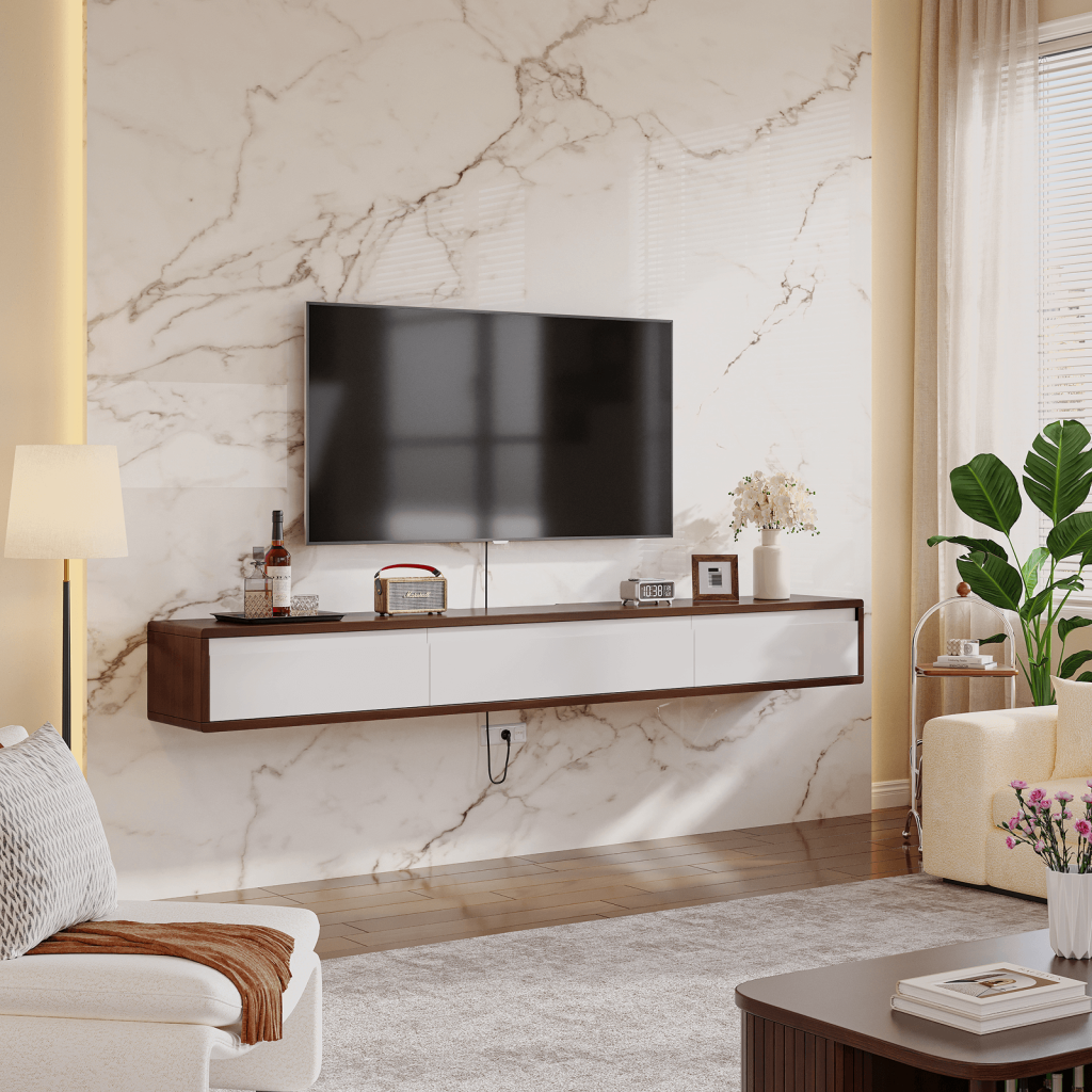
Matching with Existing Furniture
You don’t need to match everything perfectly. In fact, contrast is often better than matching.
The Sofa Connection: Look at your sofa color. If you have a dark grey couch, a light wood or white TV stand creates a pleasing separation.
Texture over Tone: Sometimes the material matters more than the color. If your room is full of flat colors (painted walls, cotton sofa), a wood-grain TV stand adds necessary texture.
The Accessories Strategy: If you are worried your new stand doesn’t match your coffee table, bridge the gap with accessories. Use a rug, vase, or throw pillows that contain colors from both pieces to tie the room together.
Practical Lifestyle Considerations
Be honest about who lives in your house.
Pets & Kids: Darker finishes (especially wood grains) are generally better at hiding scratches, marker stains, and scuffs than pristine white surfaces.
Cleaning Habits: While white shows scuffs, black glass or high-gloss dark finishes are notorious for showing dust and fingerprints immediately. If you hate dusting, a mid-tone wood finish is your best friend.
Your Personal Style & Vibe
Formal vs. Open: Do you want the room to feel grounded and cinematic (Black)? Or open, Scandinavian, and fresh (White)?
Future Flexibility: If you love to redecorate often, neutral colors (white, black, grey, oak) are safer investments than bold colors like navy or green, as they will adapt to your next wall color change.
Cases of Floaticasa TV Stand

More product case, please subscribe Floaticasa Youtube Channel.
Design Tips to Make It Work
Use Contrast, Not Camouflage: Give your furniture “breathing room.” If you have dark floors, a dark TV stand will disappear. Put a light rug underneath it to create visual separation.
Live With It: If you are unsure, tape out the dimensions on the floor and drape a sheet of the intended color (black or white) over a box to see how it affects the light in the room before buying.
Check the Light at Night: A glossy white stand might look great in the morning, but check if it reflects annoying glare from your lamps during movie night.
Room-by-Room Recommendations
The Living Room:
Small Space: Go White or Light Wood to open it up.
Large Space: Go Black or Dark Walnut to add depth and focus.
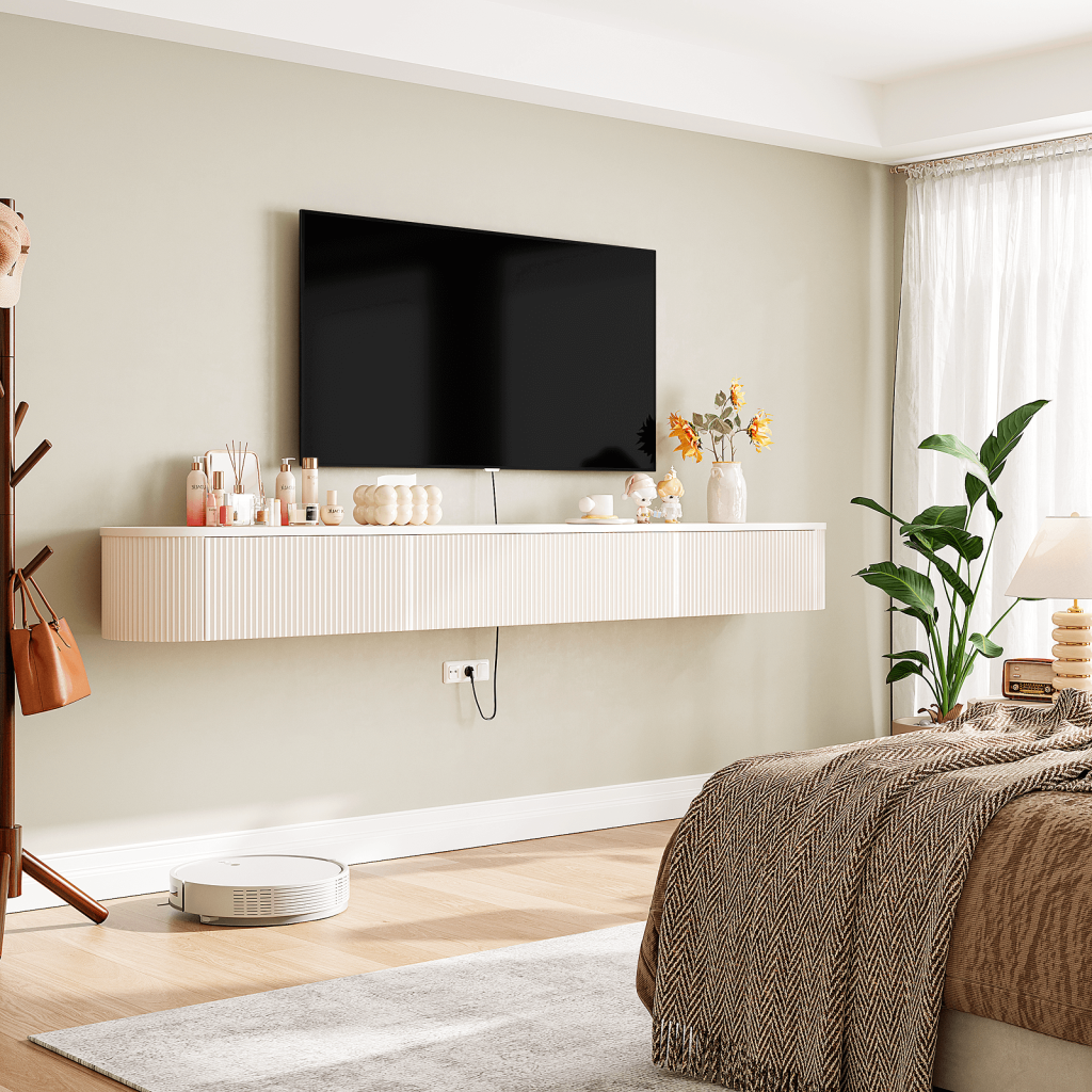
The Bedroom:
Prioritize cohesion. Match the TV stand to your bed frame or dresser to minimize visual clutter, promoting a restful environment.
Media / Home Theater Room:
Black is the undisputed king here. It minimizes light reflection and blends with the TV when off, keeping the focus strictly on the movie experience.
Conclusion
Choosing a TV stand color is a balancing act between aesthetics, your room’s unique lighting, and your practical lifestyle needs. While trends come and go, the “right” color is ultimately the one that feels harmonious in your space.
Don’t stress about matching every wood grain perfectly. Focus on the mood you want to create. Do you want a bright, energetic start to your day? Go light. Do you want a cozy, immersive movie den? Go dark.